This may be too graphic for some. I just wanted to show that our last project "Out of Context" has actual applications to convey a message. As of February 2009: PETA lifts its moratorium against McDonald's after the company fails to require that its U.S. chicken suppliers adopt a less cruel method of slaughter.
McCruelty
maribel
McCruelty
maribel
ART391- Modularity


"Dancer" was designed by Tia Dawkins-Hendricks. This alphabet was inspired by the beautiful formations that can be created by the human body, specifically the bodies of dancers. Tia and Yasmin Fletcher, a friend and fellow dancer, used various dance positions to create the letters of the alphabet. The ladies were photographed in an open space and the photographs were later silhouetted and placed on a bright pink background to enhance readability.
Modularity- ART 391

Janessa Gomez- ART 391- TagIt.ttf
My inspiration for this font came from the end credits of the movie "Slumdog Millionaire". I really like the use of an indian-style calligraphy/graffiti font on a background of bright colors. I decided to create my own calligraphy-style font and use the bright colors to outline the letters, so as to create the letters out of negative space.
ART 391 Claydough Alphabet
Modularity

Michaela Baril- ART391-Modularity
I created my alphabet starting with a simple black box and "cutting-out" shapes in order to form letters. I tried to keep the cut-outs as simple as possible with as many curved lines, rather than sharp corners, as possible.
Pedro Rodriguez - Font styles of Birth of a Hero by Last Soundtrack


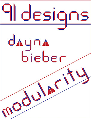
 Dayna Bieber/art 491/modularity
This font was inspired by the artist Piet Mondrian. the geometric forms reflect his use of grid structure and the color is representative of his use of primary colors. I have designed a modern typeface applicable in many contexts.


I wanted this piece to be handmade and organic, because so many typefaces today are made digitally. I also wanted the letters to demonstrate a part of me to make them MY personal alphabet. To illustrate the letters, I used locks of my hair to make each letter's shape. I held the shapes together with bobby pins, photographed them, and manipulated the images in photoshop.


Victoria Nazir-Sampaio, ART391, "Hair Today"
I wanted this piece to be handmade and organic, because so many typefaces today are made digitally. I also wanted the letters to demonstrate a part of me to make them MY personal alphabet. To illustrate the letters, I used locks of my hair to make each letter's shape. I held the shapes together with bobby pins, photographed them, and manipulated the images in photoshop.
Rolling Blows

Rolling Stones Magazine is no longer the premier rock magazine of its time. Well, its no longer a rock magazine, period. Even so, their music reviews are biased and lack depth.
Posted by
Fabian A.
Please Buy by Mariajose Urbano
Ch(F)artwells Logo
My view of the new Gatorade logo
 With the use of steroids becoming widespread in the public eye, now society has turned its attention to how serious this problem has become in professional sports. The media and National government have begun to bring the epidemic of steroids to the national eye and bringing All-stars, as well as world series winners, into congress to testify if they used illegal substances on a professional platform.
Jonathan Turner - Art 491
trapped
Subscribe to:
Posts (Atom)


