91 DESIGNS

graphic design, posters, logos, 2d /3d, ideas comments, graphic resources

Typography Collage


I was inspired by the history of the Peace sign, and how its meaning has changed over time. Today we use it so casually it seems to have lost some significance. I selected quotes and typography that illustrate the passion and integrity that originally accompanied the message of Peace.
-Liz

Pattern Design


This pattern was inspired by the book the Electric Acid Kool Aid Test, and the bright colors employed in psychedelic art. In order to set it apart I used more basic geometric shapes like lines and circles, and simple bold colors rather than the entire spectrum blended together.
- Liz Agans

Typography Collage

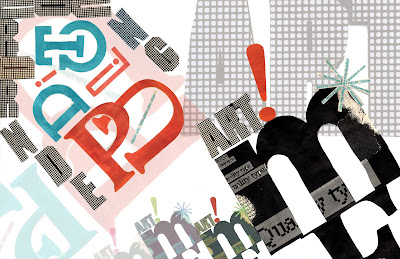
For this typography collage, I searched for a range of different text sizes and widths. I then proceeded to weave certain strips of text to create the diagonal corners. I also abstracted some type by slicing them beyond recognition. In the end, I created a grid-like design softened by the gradients and the script font. Taylor Lucas ART 291

Typography Collage

This collage focuses on bright contrasts between color.


I created two collages out of text. One based on color and the other based on different languages/countries and different time periods. When I scanned them into photoshop I combined the two and created an original piece.

Type collage


After cutting out the pieces that were visually appealing to me, I organized them by color scheme. As I was looking at the pieces, it came to me to put them in a sort of bell curve by color group. Once I had those little groupings, I thought it looked sort of like a cityscape... When I added words of varying transparencies in Illustrator, I took into consideration what the words were actually saying + added continuations or responses to the magazine clippings. Annika Jensen - ART 291

Typography Collage


I created a collage based on words of a woman and love found in womens' magazines. I made the background transparent so the heart and the quote would stand out.Lauren Dresbach ART291

Typography Collage


I created this piece based on balance of two different colors and black, creating two heavy corners and then playing with the same objects and the opacity in the background.
Micole Alkabes- ART 291

Typography Collage

Matt Wallach
ART 291
Cynicism got the best of me when a copy of Cosmo landed in my lap. I took its words out of context to create a collage of pop culture gone awry.

Typography Collage


Ashley McKevitt
ART 291
I used typography found in women's magazines to create a composition that displays the demanding messages sent to the female population. I manipulated the image in photoshop and illustrator.

Tulip Pattern - Nicole Brener


I decided to make a pattern out of distorted tulips playing with a dark yet elegant colors.

Pattern Design


The second pattern is meant to draw the eye to the individual skull designs, whereas the first is meant to be seen as more of the whole, without a true focal point.


Craig Shervin - Art 291