
Observing points, lines and planes on campus.
Liz Agans

graphic design, posters, logos, 2d /3d, ideas comments, graphic resources


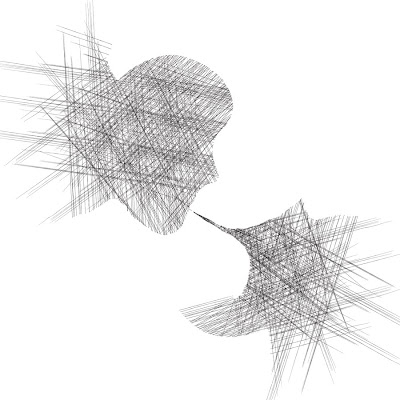


 Media: Mirror and chinese ink
 Media: Mirror, ink, a friend, and another mirror
 Media: I used a mirror and chinese ink.


