
graphic design, posters, logos, 2d /3d, ideas comments, graphic resources
"M" for Magalenha

The song "Magalenha" was chosen in class as a theme for this creative tile. My immediate thoughts were Brazil and Samba. I decided to graphically interpret the song with the colorful lines to indicate the pulse of the song.
Grow Green

Amnesty Poster to create awareness for the legalization of Marijuana. I chose to create the recycle logo out of Marijuana leaves to indicate that it could be used for many other things other than a drug. Marijuana could be used for its hemp fibers and oil. For example, hemp oil burns clean unlike petroleum and hemp fuel does not contribute to global warming .
Syrup and Honey

For the liquid type project I was inspired by the song "Syrup & Honey" by Duffy. I created the type using caramel syrup and honey.
Concrete Wave


Publication design inspired by longboarding. The written article describes the different styles of the sport and which board is best for the style.
HEY!! Dance

The repetition of the word hey really stood out to me when listening to the song. I visualized bright colors and people dancing. - Tia Dawkins-Hendricks


energy burst.
 [graphic interpretation of a pice of music]
 for me, the piece of music evoked energy, movement, organic shapes and positivity. the lines, shapes, and colors used work together to communicate this. overall, i wanted to illustrate a burst of life, energy and happiness.


U Color My World by Allison Brown
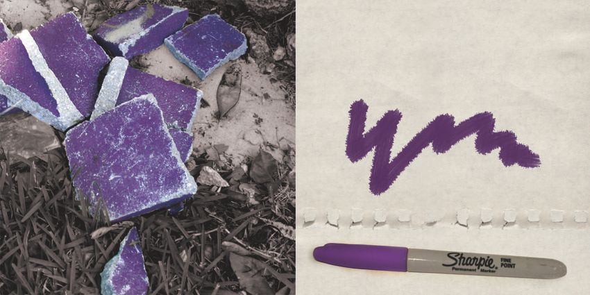
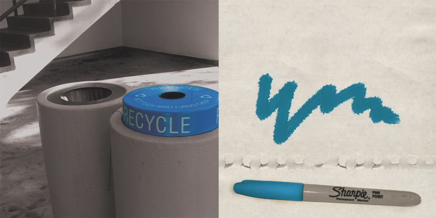
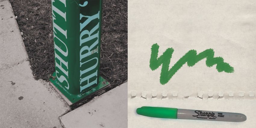
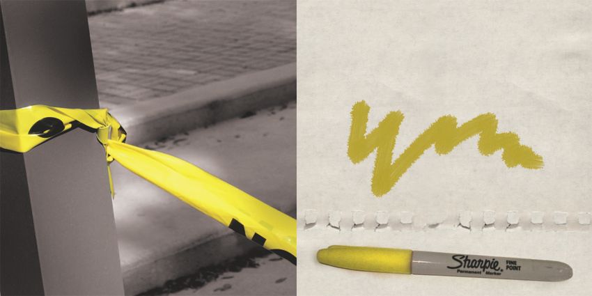
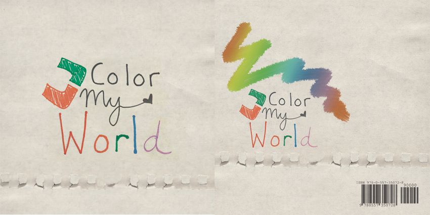
When given an assignment to walk around campus and take pictures from the art building to the Lowe Art Museum, the idea of colors quickly came to mind. I decided to tell a story of the various colors I observed while on the path so each page of this booklet is a different themed color. Also, the idea of U Color My World is has a double meaning. The U is obviously our school, and this was taken on campus and the other meaning is just the playful"You Color My World" with a rainbow of colors. The spreads are below:
Amnesty International Poster
 Ashley McKevitt
ART491
I created a poster advocating for gay rights (specifically that of marriage).
Azibo
The Azibo design was derived from the Egyptian god of music Hathor, who was always depicted with a circle (symbolizing the sun) with horns. This was only taken as inspiration in order to create a contemporary logo. The bright colors were chosen to convey the modern feel of the band. The more muted colors were selected to evoke the organic sense for which the band Azibo (which means "earth") stands for. The typography was chosen to combine both these modern and organic motifs. Lastly, the logo was made to be able to stand on its own, without the text.


Liquid Typography by Allison Brown
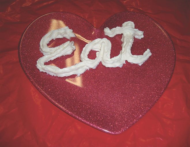
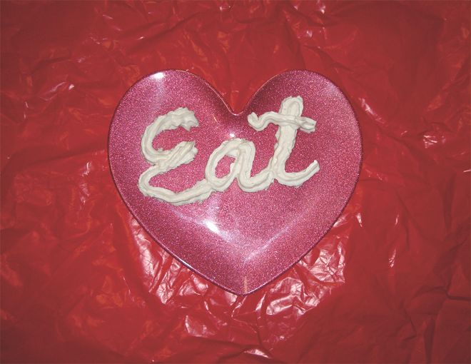
I've always wanted to make letters out of whipped cream so here I finally had the opportunity!


Creative Tile: Artbook
10 spreads focusing on some of the text we come across everyday on campus and how through the use of close-ups and rearrangement, they can take on new forms and meanings.


Subscribe to:
Comments (Atom)

