"The Ibis yearbook benefits future designers because it gives them portfolio work that is published, we pay for the completed work ($15.) and it gives the student a better sense of the school they attend. Work for designers is set up on a first come, first serve system."
Kenneth Garcia, Design Director Ibis Yearbook 2010
ibisyrbkdesign@gmail.com
305.450.3843

graphic design, posters, logos, 2d /3d, ideas comments, graphic resources


INTERNSHIPS

FriendsWithYou (FWY) is a Miami-based art collective established in 2002. It has since developed into a multidisciplinary creative studio where art, creative design, paintings, sculptures, live performances, art installations, designer product lines, published works, and various animation, motion picture and multimedia projects happen! Basically they are a huge creative force in Miami right now and they are looking for fresh talent!
There are two internship opportunities:
Graphic Design and Creative Program
- working with creative directors/owners of the company to develop creative concepts for internal projects and commercial work for hire.
- includes: illustration, character design, poster design, computer graphics, print design, layout design, branding, packaging, web design, and full motion media animation (i.e. live-action, animation, stop-motion, etc.)
and
Integrated Marketing Program
- Management of online content for the many FWY sites and online communities
- Organization of FWY direct marketing initiatives and newsletters
- Coordination with designers and creative teams to further along production flow
- General organization of marketing department internal initiatives
- Minimal to some design work if interested
Internship require a minimum 3 monts commitment, and could lead to long-term hire in the future. Hours and dates are flexible, and range from regular business hours to afterhours and can accommodate your schedule!.
The work will be done at the awesome FriendsWithYou Studio in the Miami Design District.
If intersted, please send a CV/Resume and sample(s) of your work to Nathaly Charria atnathaly.charria@FriendsWithYou.com
Check them out at www.FWYstudios.com or www.FriendsWithYou.com
Magic Luck and Friendship, All!

Pattern design

I sketched a design with markers and scanned it into Illustrator. After using live trace, I made a larger pattern using mirror images. I added layers to the design by using large paintbrush strokes of different colors and opacities.
Ashley McKevitt
ART291

Pattern Project
Annika Jensen - ART 291

I started my pattern by first using paintbrushes in Illustrator to draw the cupcake itself, from the decorative icing to the cupcake wrapper. Then, I laid it on top of three circles in pastel colors. That entire image became my icon, which I simply repeated in a grid large enough to see the details of the cupcake, but not overwhelmingly so.


typekit:rendering fonts in today's browsers
the service will be launching soon- You can sign up for a free trial.


Repair the World Posters


Dayna Bieber
ART491 - Pease
"Tikkun Olam"
Israel is the only country in the world that has more trees today than it did during the 20th century. I was inspired to create a poster that highlighted this fact and encouraged others to follow in Israel's footsteps.

Point, Line and Plane

This image was created in Illustrator and is an example of how points, lines, and planes are used as the basics of design. - Jessica S.

Observing points, lines and planes on campus. - Liz Agans

- Liz Agans
 - Lauren Dresbach


- Lauren Dresbach

Observing the use of point line and plane in objects that we see everyday.
Micole Alkabes - Art 291


- Nicole Brener ART291

Ashley McKevitt - ART 291

Ashley McKevitt - ART 291
These photos express the basics of design (point, line, and plane) found in nature.


 Annika Jensen - ART 291
6 photographs that reveal point, line, and plane in everyday life.
- Matt Wallach
- Matt Wallach

Three abstract designs, each utilizing only one element of design.
(line, plane, and point, respectively)
- Matt Wallach
- Matt Wallach
Typography

This typography uses arrows as the structure of each letter and brushes to add texture and aesthetics.
- Craig Shervin, ART291
- Craig Shervin, ART291


In this assignment I was to make a word out of any liquid and document it with a photo. But I also wanted to focus on its changing nature; that is, that liquid never sits still and is inherently ever-changing. I chose to use water and document its change from single droplets to, when the table and the water become similar in temperature, something more blurred. When that happens the many droplets condense and the distinction of each letter is less pronounced.
- Pedro Rodriguez
- Pedro Rodriguez

The liquid I chose to create this was egg yolk. It was a very sticky, messy project, but I tried to not have that show in the poster.
- Julie Rega
- Julie Rega
 An alphabet designed using columns and vines.
 - Liz Agans

A font design created from the simple image of a barcode.
- Jacqueline Gion
- Jacqueline Gion

An alphabet created with multi-colored JENGA blocks.
- Jessica S.
- Jessica S.

Typography based on linear perspective, strong diagonals and distortion.
- Micole Alkabes, ART291

My design is based on a simple concept using paper clips to form the letters of the alphabet using the principle of modularity.
- Nicole Brener, ART291

My alphabet is based on round, curvy shapes contrasting with straight, long lines to create a celestial vibe. This font could be used for regular text and/or headlines.
Annika Jensen - ART291

My alphabet is based on round, curvy shapes contrasting with straight, long lines to create a celestial vibe. This font could be used for regular text and/or headlines.
Annika Jensen - ART291

Playing with honey.
- Francisco Cabana, ART491

A modern/minimalist lower-case typeface created with lines, circles, and portions thereof.
Size disparity in some letters was both intentional and necessary to maintain the aesthetic.
- Matt Wallach
 Media: Mirror and chinese ink
Setting: In a bathroom about to wash out the work
Meaning: It reads Judge me and when you turn it around it says I Dare You
- Anabelle Paulino
 Media: Mirror, ink, a friend, and another mirror
Setting: inside a bathroom with a large mirror
Message: the mirror says Judge me, and when you turn it around, it reads I Dare You
- Anabelle Paulino
 Media: I used a mirror and chinese ink.
What it says: You're unique, just like everybody else
Setting: Balcony of a friends house in brickell while it started raining.
- Anabelle Paulino

Liquid Type- Acrylic metallic paint
Juliana Aragao, ART 491
 Modularity
- Ashley McKevitt

This alphabet was created using the modular elements of a solid black square and white circles.
I experimented with these simple shapes to create letter forms in the most basic sense.
- Taylor Luca, ART 291
 - Jacqueline Tumas, Art 491


Liquid Typography
- Dayna Bieber, ART 491


"Alphabet"
Taylor Palmer
ART 391- Spring '09
Claydough was inspired by the bright colors and lucid curvature of children's modeling clay to create a "kid friendly" design.

"Applebet"
Nicky Wyman, ART391 - Spring '09
The letters were made by taking bites out of the apples and using teeth to carve out the letters.
It was a tasty project.

"Tag It"
Janessa Gomez- ART 391, Spring '09
My inspiration for this font came from the end credits of the movie "Slumdog Millionaire". I really like the use of an indian-style calligraphy/graffiti font on a background of bright colors. I decided to create my own calligraphy-style font and use the bright colors to outline the letters, so as to create the letters out of negative space.

Terence Gaffney
ART 391 - Spring '09
The alphabet is based off of the way smoke billows and rises. I wanted to create something very transparent, creating new layers and shapes based off of existing curvilinear lines.

Michaela Baril- ART391- Modularity
I created my alphabet starting with a simple black box and "cutting-out" shapes in order to form letters. I tried to keep the cut-outs as simple as possible with as many curved lines, rather than sharp corners, as possible.

 Pedro Rodriguez - Font styles of Birth of a Hero by Last Soundtrack
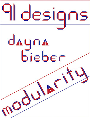
 Dayna Bieber/art 491/modularity
This font was inspired by the artist Piet Mondrian. the geometric forms reflect his use of grid structure and the color is representative of his use of primary colors. I have designed a modern typeface applicable in many contexts.


Victoria Nazir-Sampaio, ART391, "Hair Today"
I wanted this piece to be handmade and organic, because so many typefaces today are made digitally. I also wanted the letters to demonstrate a part of me to make them MY personal alphabet. To illustrate the letters, I used locks of my hair to make each letter's shape. I held the shapes together with bobby pins, photographed them, and manipulated the images in Photoshop.
Subscribe to:
Posts (Atom)

