

This typography uses arrows as the structure of each letter and brushes to add texture and aesthetics.
- Craig Shervin, ART291
- Craig Shervin, ART291


In this assignment I was to make a word out of any liquid and document it with a photo. But I also wanted to focus on its changing nature; that is, that liquid never sits still and is inherently ever-changing. I chose to use water and document its change from single droplets to, when the table and the water become similar in temperature, something more blurred. When that happens the many droplets condense and the distinction of each letter is less pronounced.
- Pedro Rodriguez
- Pedro Rodriguez

The liquid I chose to create this was egg yolk. It was a very sticky, messy project, but I tried to not have that show in the poster.
- Julie Rega
- Julie Rega
 An alphabet designed using columns and vines.
 - Liz Agans

A font design created from the simple image of a barcode.
- Jacqueline Gion
- Jacqueline Gion

An alphabet created with multi-colored JENGA blocks.
- Jessica S.
- Jessica S.

Typography based on linear perspective, strong diagonals and distortion.
- Micole Alkabes, ART291

My design is based on a simple concept using paper clips to form the letters of the alphabet using the principle of modularity.
- Nicole Brener, ART291

My alphabet is based on round, curvy shapes contrasting with straight, long lines to create a celestial vibe. This font could be used for regular text and/or headlines.
Annika Jensen - ART291

My alphabet is based on round, curvy shapes contrasting with straight, long lines to create a celestial vibe. This font could be used for regular text and/or headlines.
Annika Jensen - ART291

Playing with honey.
- Francisco Cabana, ART491

A modern/minimalist lower-case typeface created with lines, circles, and portions thereof.
Size disparity in some letters was both intentional and necessary to maintain the aesthetic.
- Matt Wallach
 Media: Mirror and chinese ink
Setting: In a bathroom about to wash out the work
Meaning: It reads Judge me and when you turn it around it says I Dare You
- Anabelle Paulino
 Media: Mirror, ink, a friend, and another mirror
Setting: inside a bathroom with a large mirror
Message: the mirror says Judge me, and when you turn it around, it reads I Dare You
- Anabelle Paulino
 Media: I used a mirror and chinese ink.
What it says: You're unique, just like everybody else
Setting: Balcony of a friends house in brickell while it started raining.
- Anabelle Paulino

Liquid Type- Acrylic metallic paint
Juliana Aragao, ART 491
 Modularity
- Ashley McKevitt

This alphabet was created using the modular elements of a solid black square and white circles.
I experimented with these simple shapes to create letter forms in the most basic sense.
- Taylor Luca, ART 291
 - Jacqueline Tumas, Art 491


Liquid Typography
- Dayna Bieber, ART 491


"Alphabet"
Taylor Palmer
ART 391- Spring '09
Claydough was inspired by the bright colors and lucid curvature of children's modeling clay to create a "kid friendly" design.

"Applebet"
Nicky Wyman, ART391 - Spring '09
The letters were made by taking bites out of the apples and using teeth to carve out the letters.
It was a tasty project.

"Tag It"
Janessa Gomez- ART 391, Spring '09
My inspiration for this font came from the end credits of the movie "Slumdog Millionaire". I really like the use of an indian-style calligraphy/graffiti font on a background of bright colors. I decided to create my own calligraphy-style font and use the bright colors to outline the letters, so as to create the letters out of negative space.

Terence Gaffney
ART 391 - Spring '09
The alphabet is based off of the way smoke billows and rises. I wanted to create something very transparent, creating new layers and shapes based off of existing curvilinear lines.

Michaela Baril- ART391- Modularity
I created my alphabet starting with a simple black box and "cutting-out" shapes in order to form letters. I tried to keep the cut-outs as simple as possible with as many curved lines, rather than sharp corners, as possible.

 Pedro Rodriguez - Font styles of Birth of a Hero by Last Soundtrack
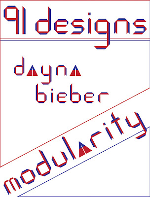
 Dayna Bieber/art 491/modularity
This font was inspired by the artist Piet Mondrian. the geometric forms reflect his use of grid structure and the color is representative of his use of primary colors. I have designed a modern typeface applicable in many contexts.


Victoria Nazir-Sampaio, ART391, "Hair Today"
I wanted this piece to be handmade and organic, because so many typefaces today are made digitally. I also wanted the letters to demonstrate a part of me to make them MY personal alphabet. To illustrate the letters, I used locks of my hair to make each letter's shape. I held the shapes together with bobby pins, photographed them, and manipulated the images in Photoshop.

